
Introduction
Brand strategy and positioning
Brand portfolio and architecture
Naming strategy
Identity design
Logo creation
Messaging
Tone-of-voice
Brand guidelines
When Campbell Media Agency first approached us, they were a small company with massive aspirations. Their goal was ambitious: grow from three clients to a $30M valuation in two years. To get there, they needed to cut through some serious noise in the market. Our task was to build a bold, new brand to do just that.









Brand strategy
Our work started by challenging long-held assumptions about what the market really wanted. In the world of media agencies, the prevailing wisdom has been that ambiguous reports can overcome a multitude of sins. But really, clients were tiring of endless spin tactics and data-driven drivel. They wanted a partner that could crunch the numbers, and then amplify only what mattered.
Naming strategy
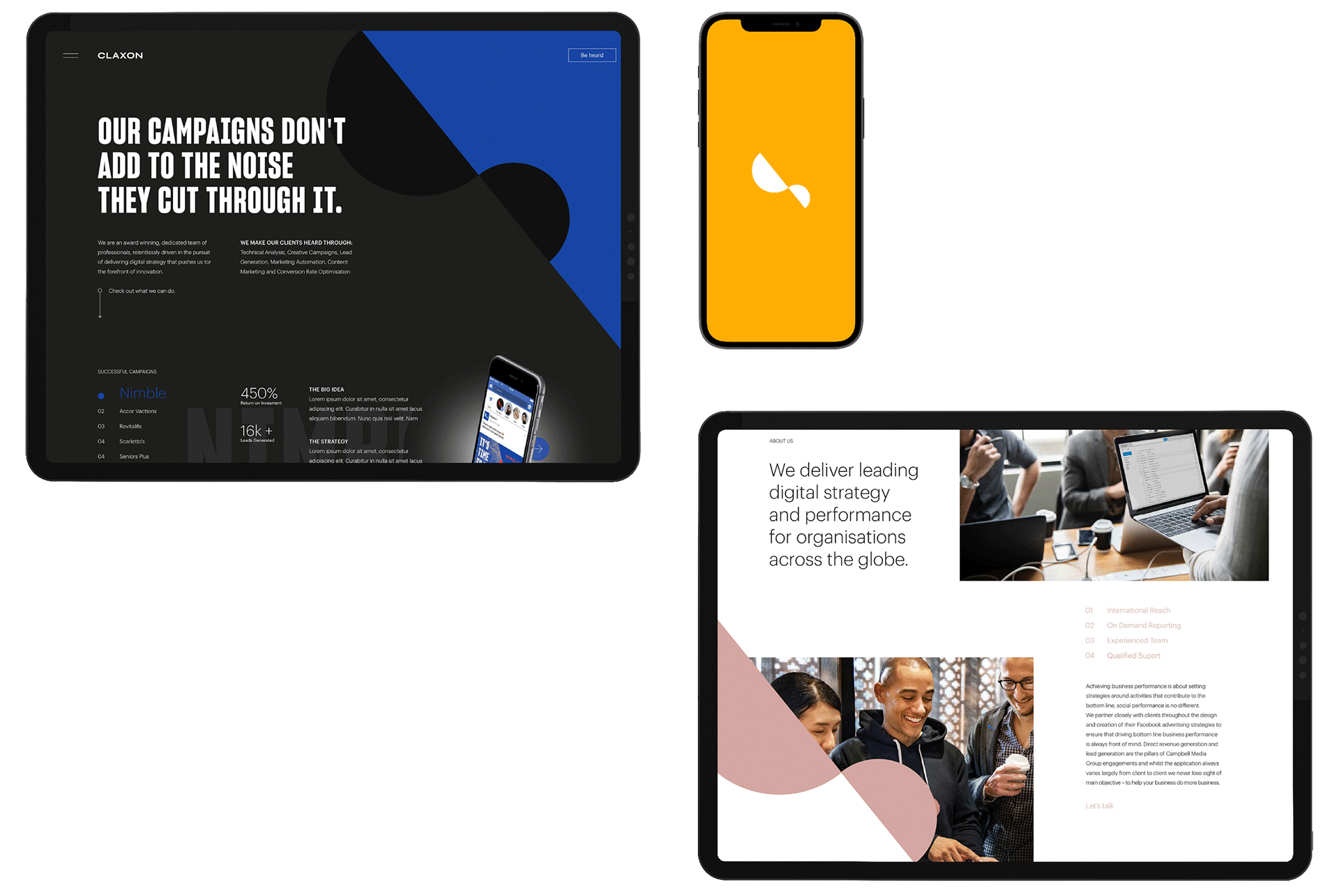
With a truer understanding of the market’s needs, we set about creating an identity that spoke volumes. We landed on the name Claxon. It’s a loud, confident statement of intent that aligns to founders’ fearless aspirations. It signals the company’s understanding of the importance of being heard––both in-market and in client meetings.




Identity design
The new design for Claxon was also inspired by the power of being heard. Using the variance and symmetry of sound waves, we created a dynamic shape that serves as an emblem and flexible graphical element. Paired with a bold color palette, it amps up attention in every context.


“The decision to move forward with Flagship was the single point in which everything changed for us. When we met with them, we felt like our skillset and the clients we were attracting weren’t aligned. So, we gave them a full license to create. We told them to give us what we needed, not what we wanted. What they came back with was nothing short of world-class. Both the messaging and visual expression resonated with the market so deeply that it provided the launchpad for 200%+ YOY growth. We’ve also referred a number of our clients to them, knowing it will benefit their performance and long-term business goals.”