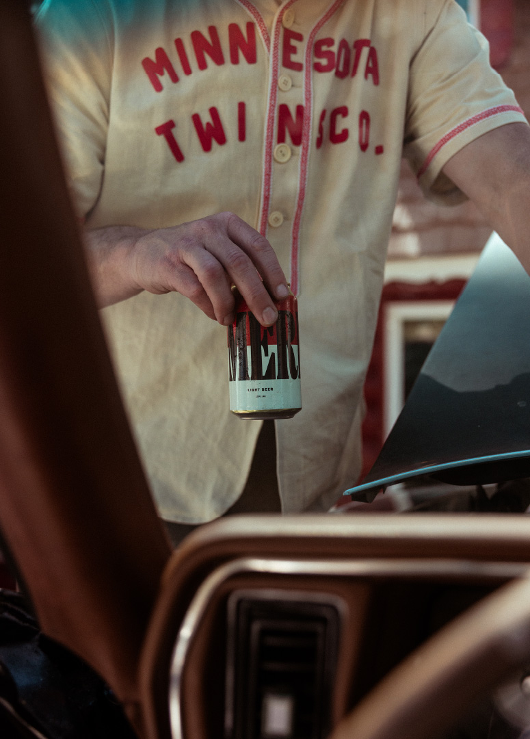
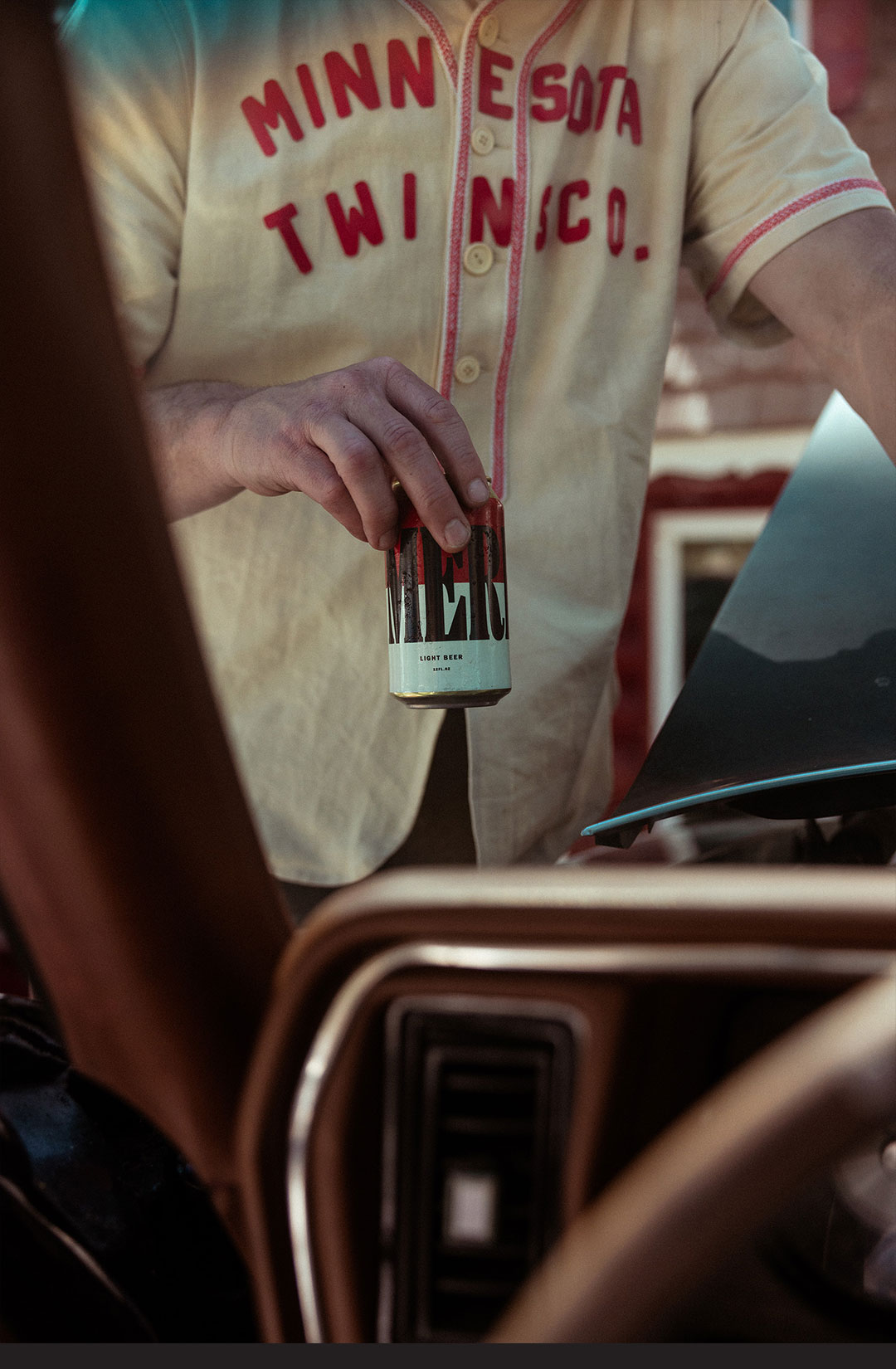
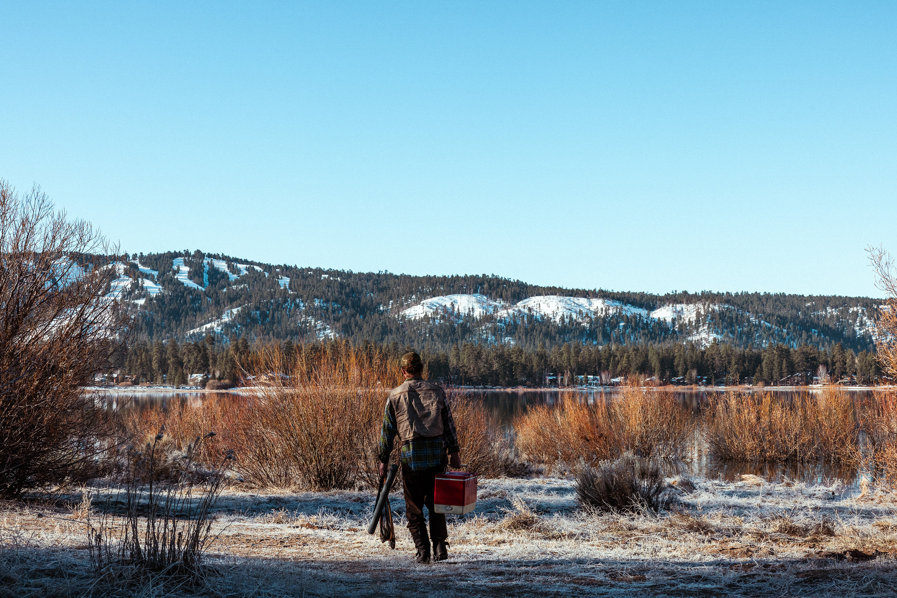
Brand messaging
However, as with America, the brand name, MERICAN, is infused with many potential assumptions about who it’s for and the values it represents. We knew we couldn’t line-dance around this, so we addressed it head-on with a succinct tagline: MADE FOR ALL™.
Visual identity
With our strategic direction locked in, we went to work on bringing it to life visually. Whether it’s a dive bar in Los Angeles or a saloon in Bozeman, bar walls are lined with history: old beer advertisements, neon signs, taxidermy, and collectibles. We set out to create something that fits these timeless, legendary identities. In other words, how do we make something brand spankin’ old?
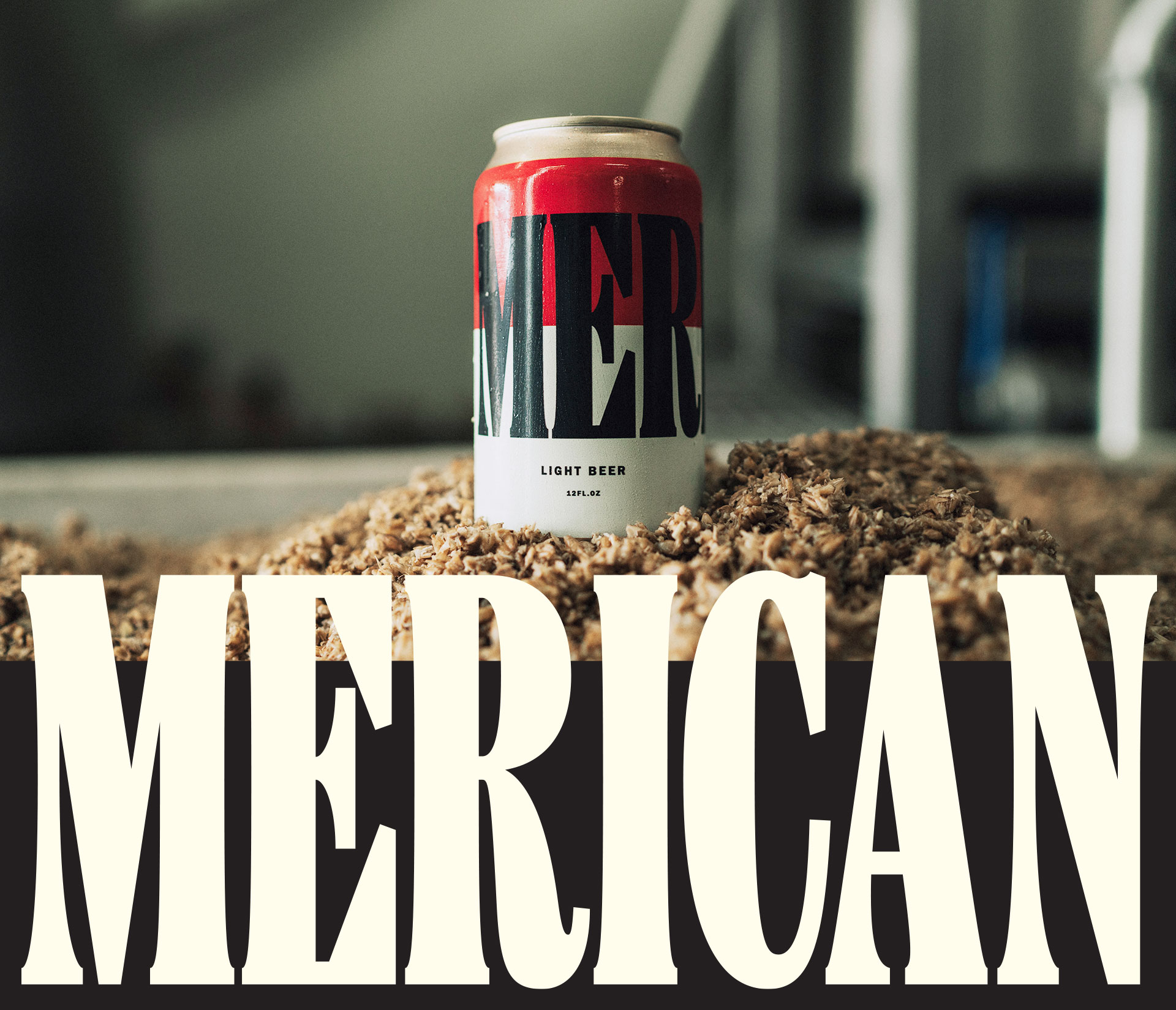
We landed on a bold, uncomplicated wordmark that looks like it was made in simpler times. And yes, the typeface was American-made (because we love a good Easter egg!).
Visual identity
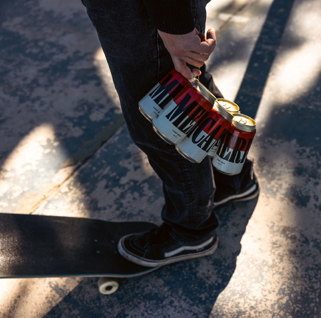
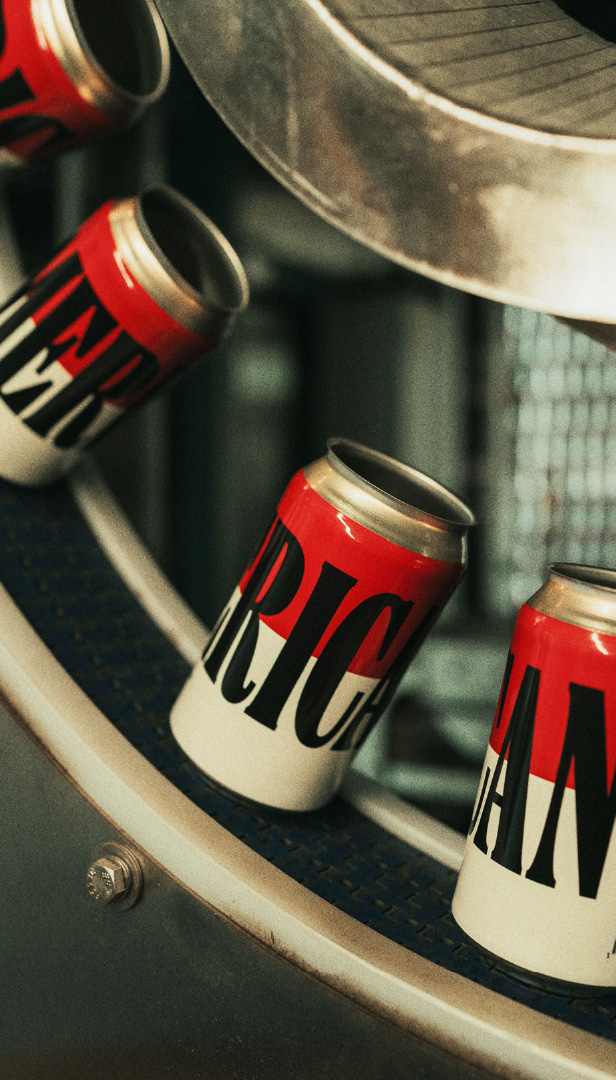
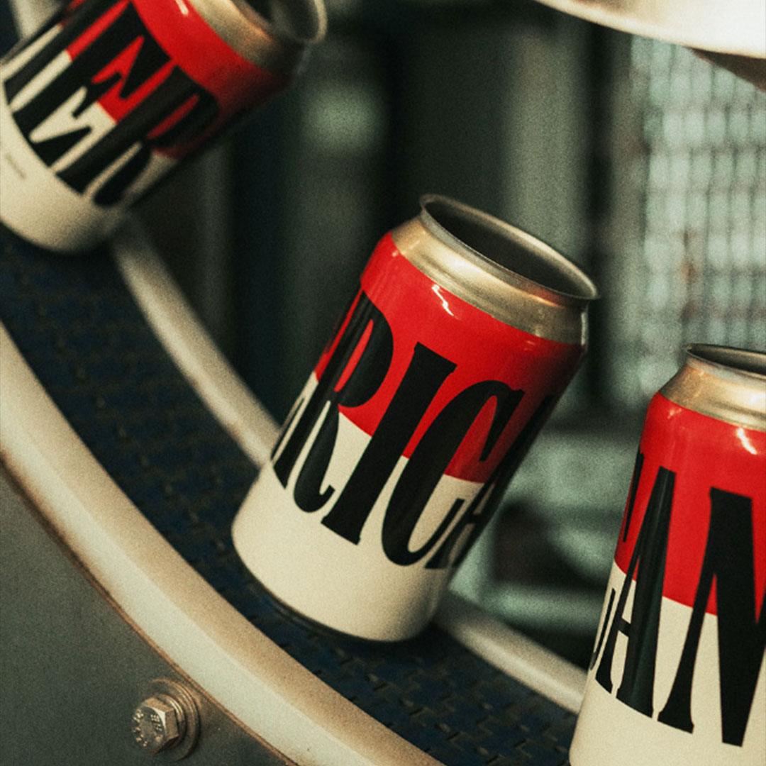
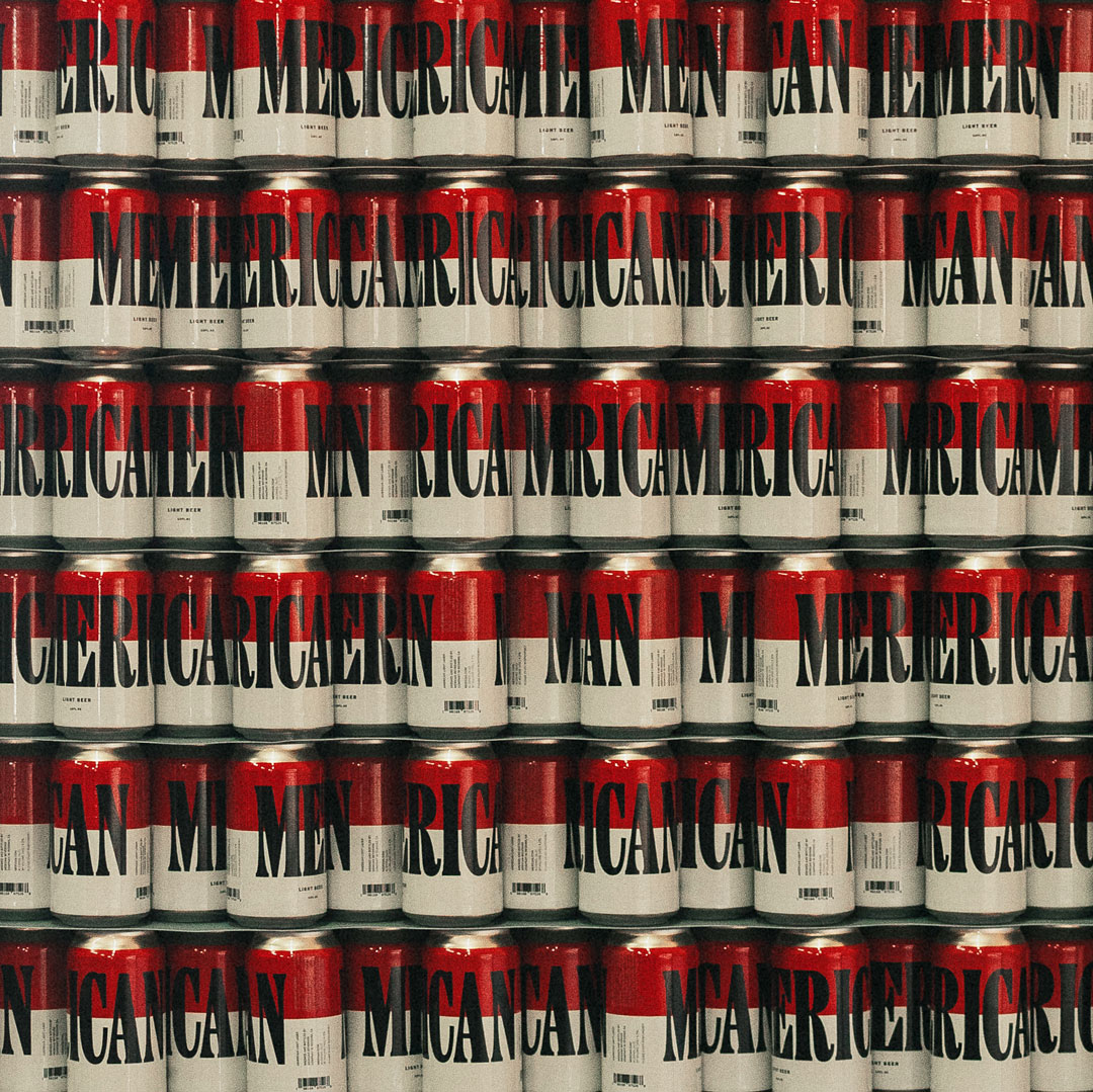
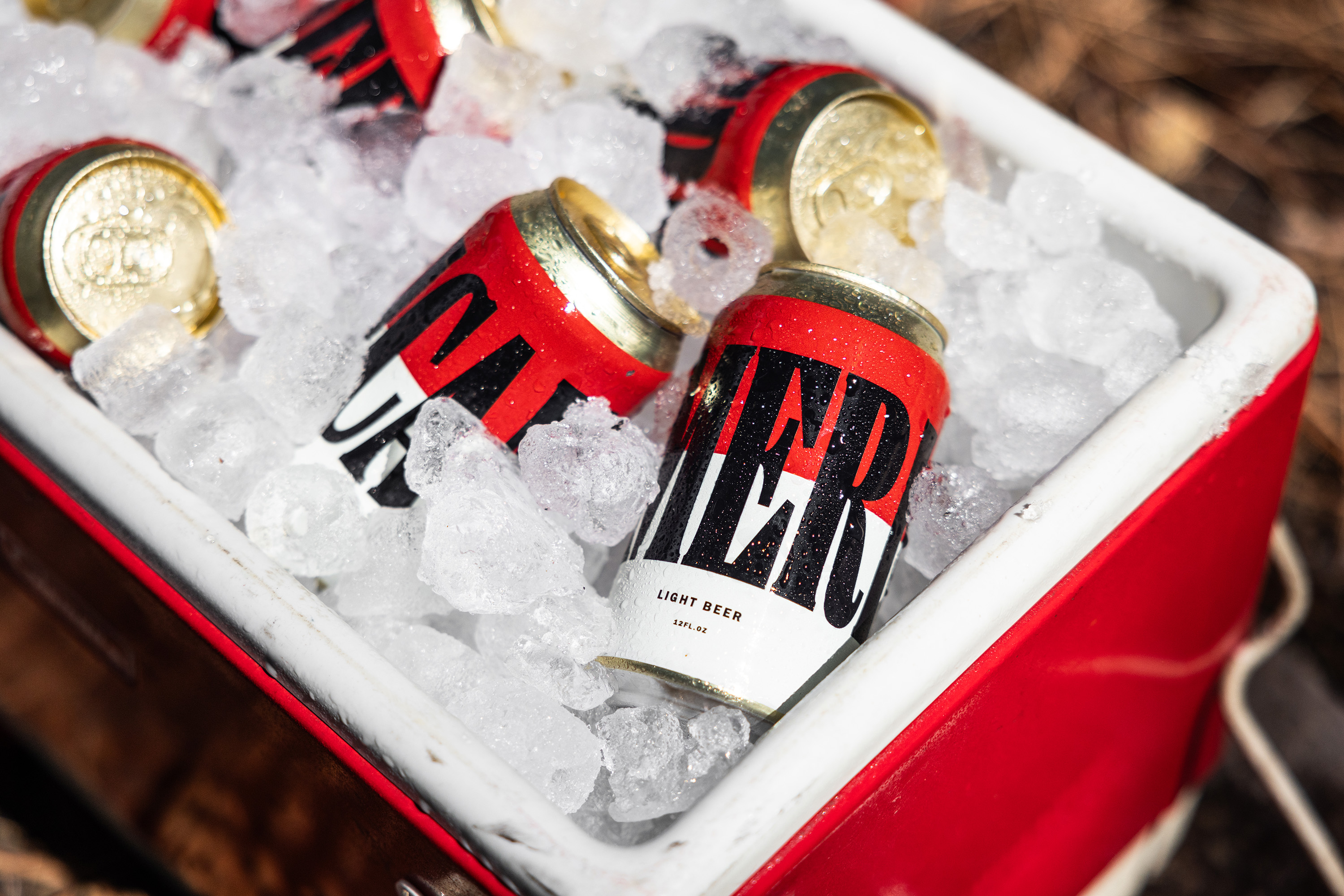
On the shelf, we wanted to remain familiar without getting lost in a sea of cans. So we landed on a design that channels a packet of Marlboro or an Andy Warhol Campbell’s Soup Can, depending on your cultural lens.
Oh, and when the cans are stacked vertically and horizontally on a shelf it makes the red and white stripes from the American flag, a real attention grabber, the star of the show. Or the stripe of the show?


