Introduction
Brand messaging
Visual ID
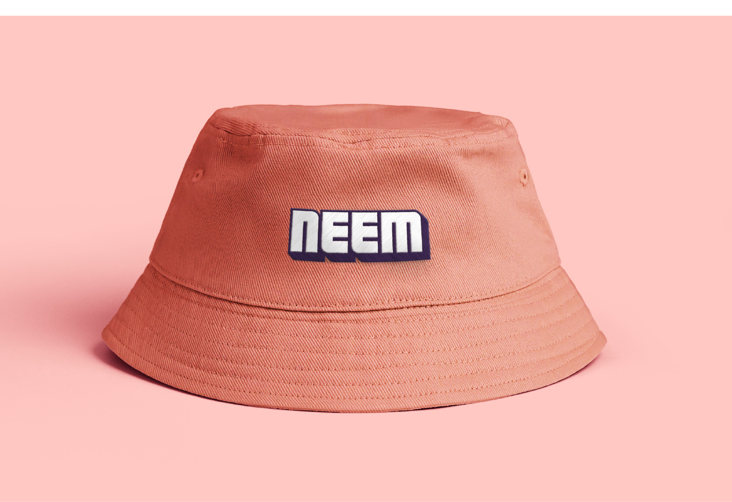
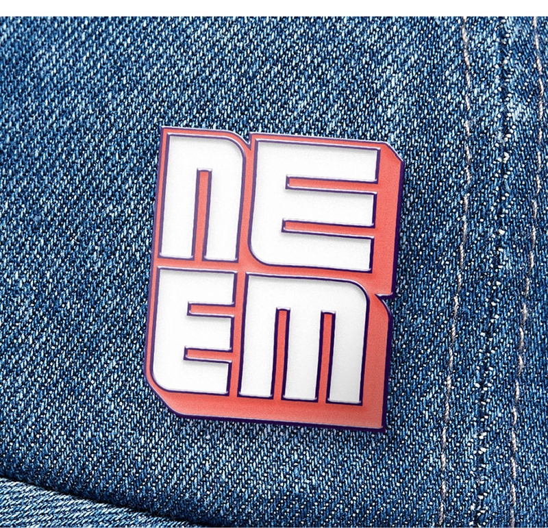
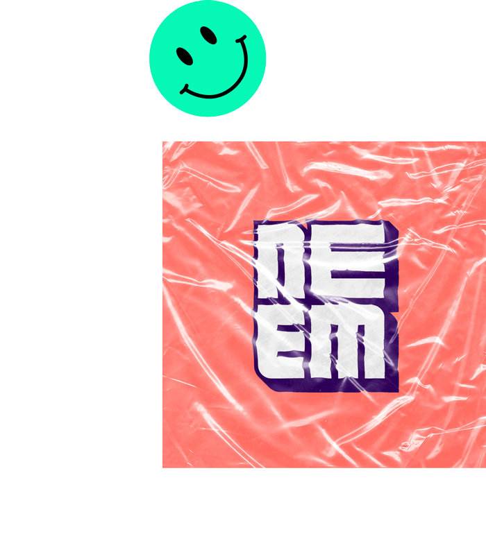
Logo
Wordmark
Color selection
Font selection
Animated identity
Distinct patterns and textures
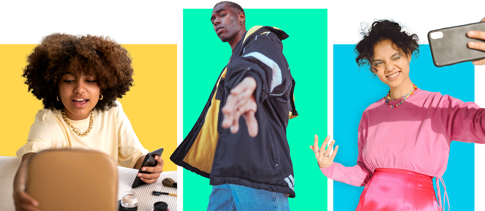
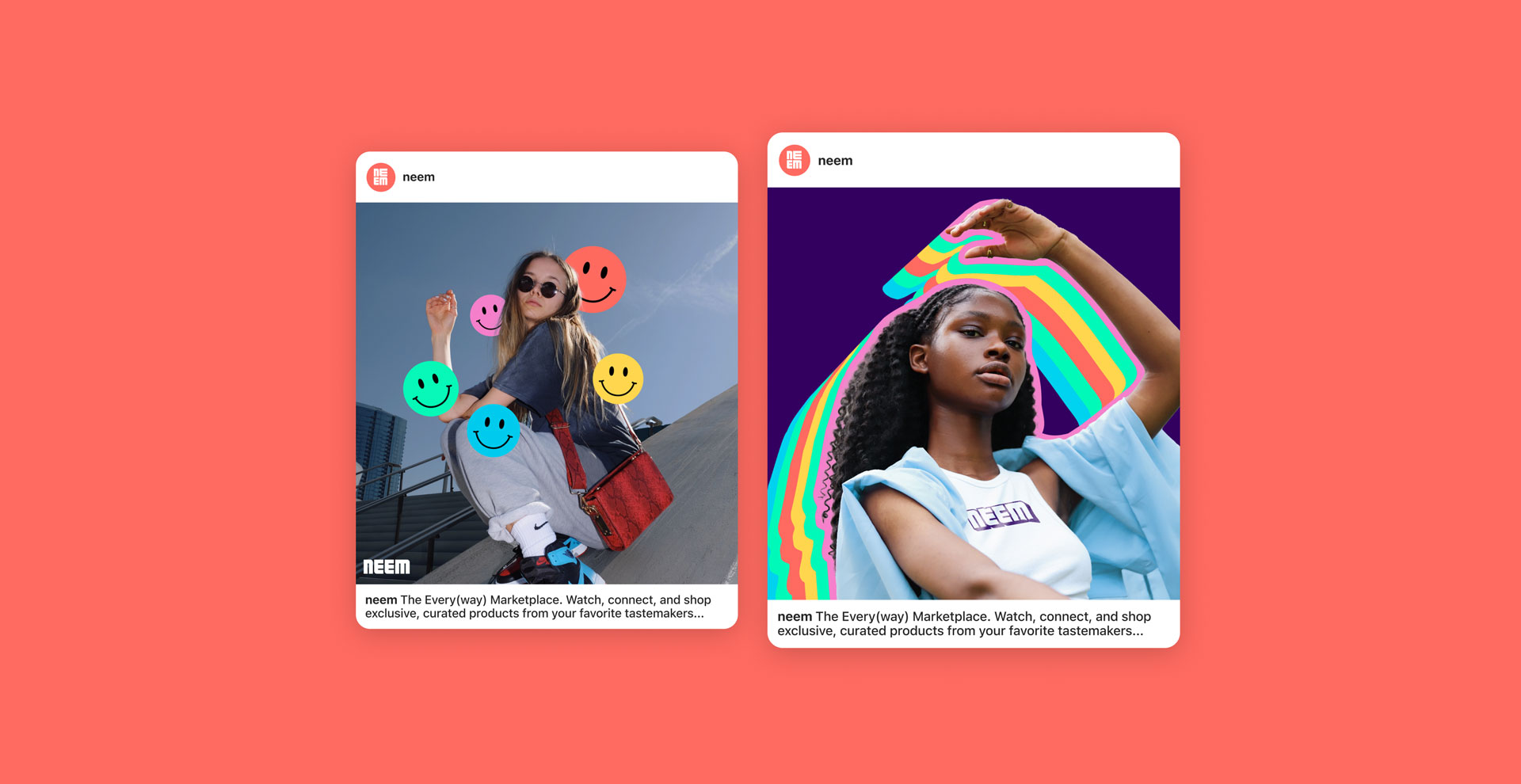
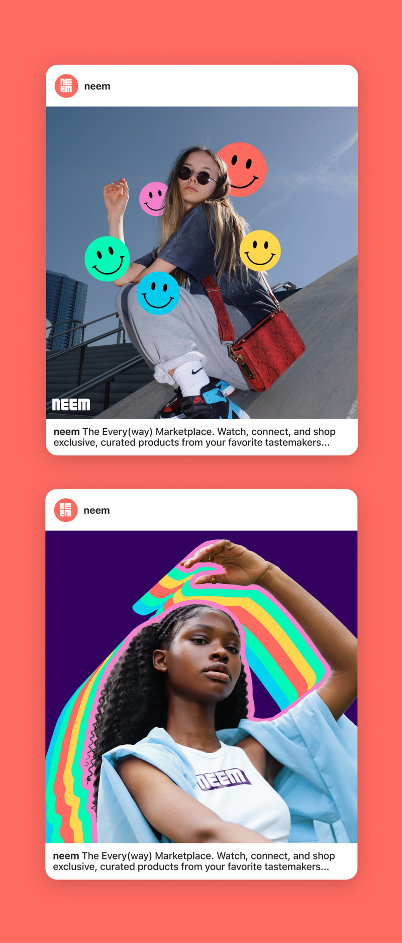
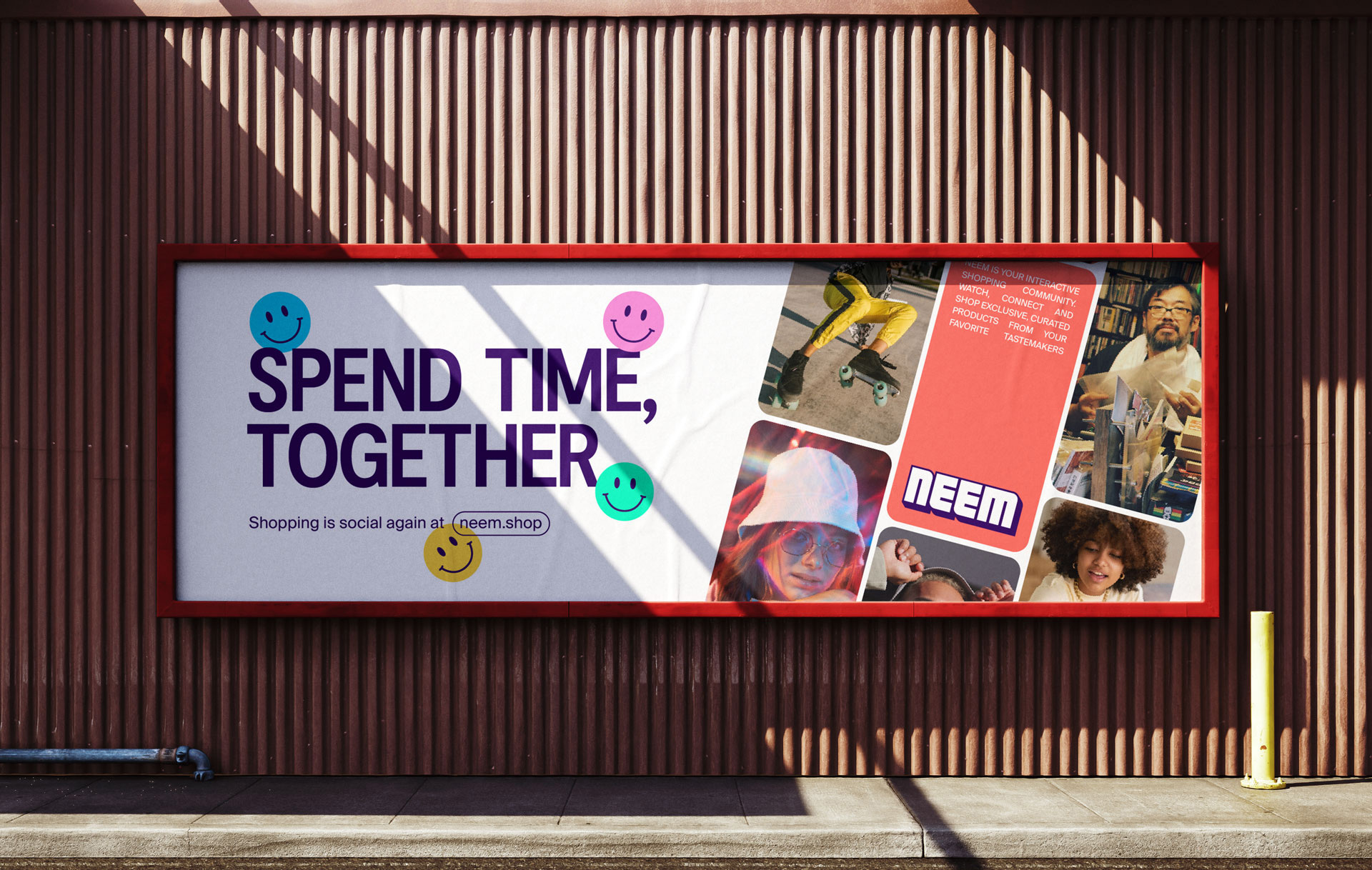
Brand mocks
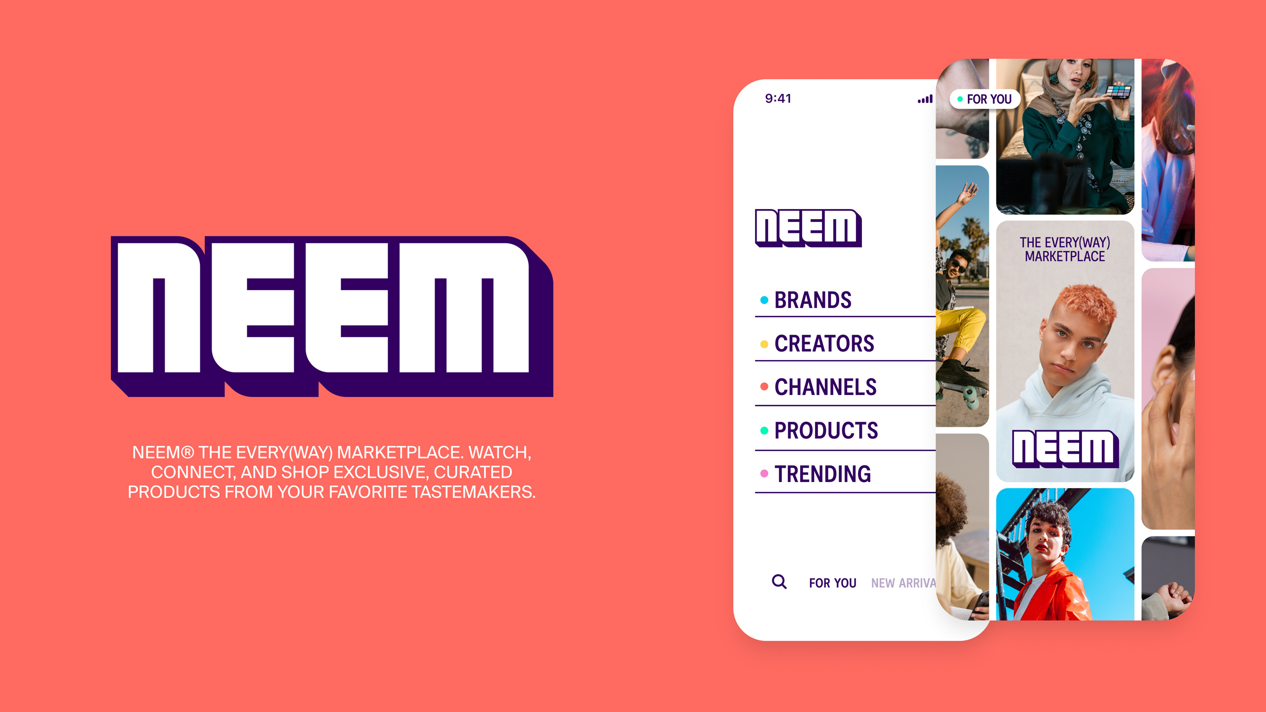
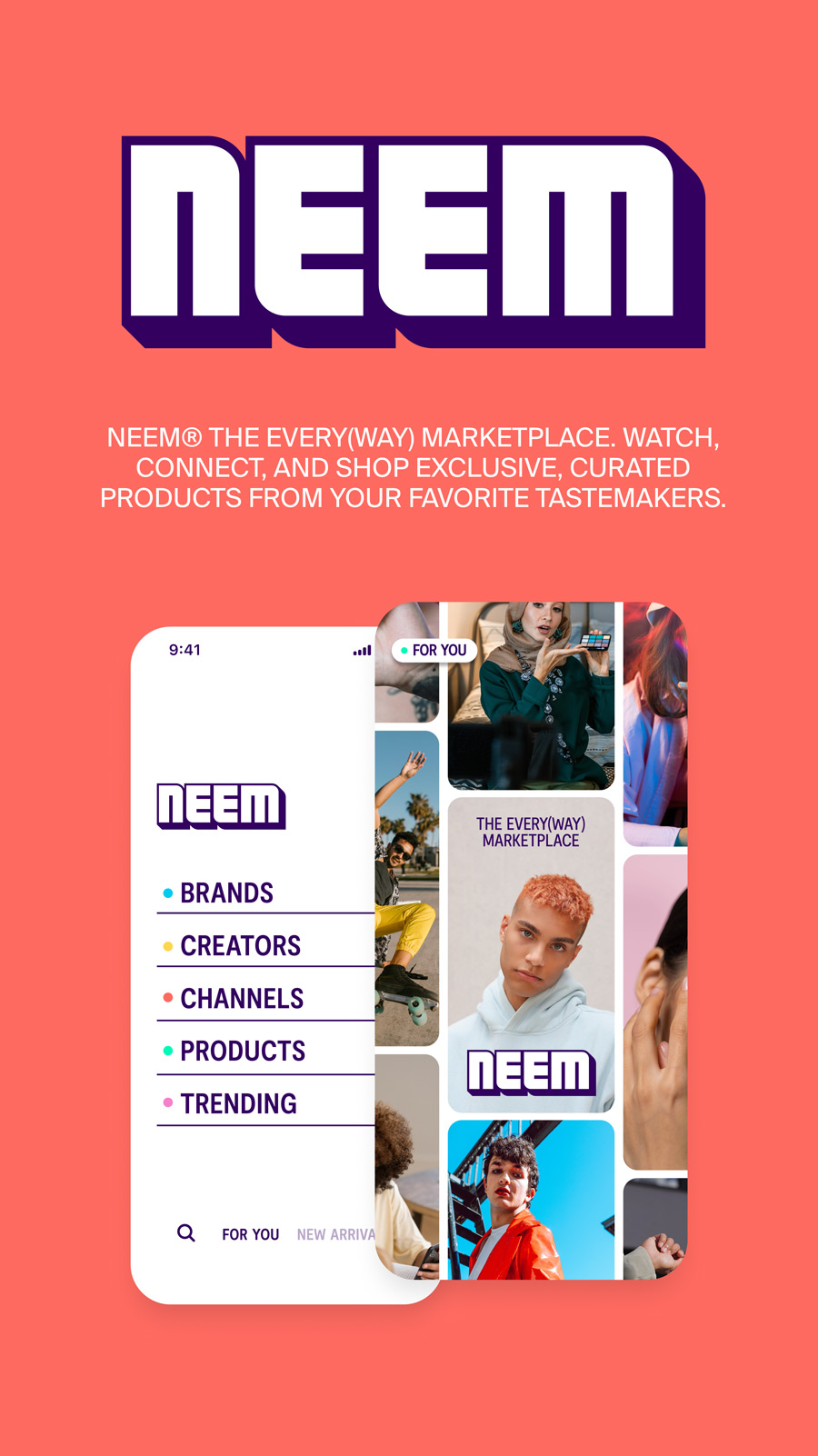
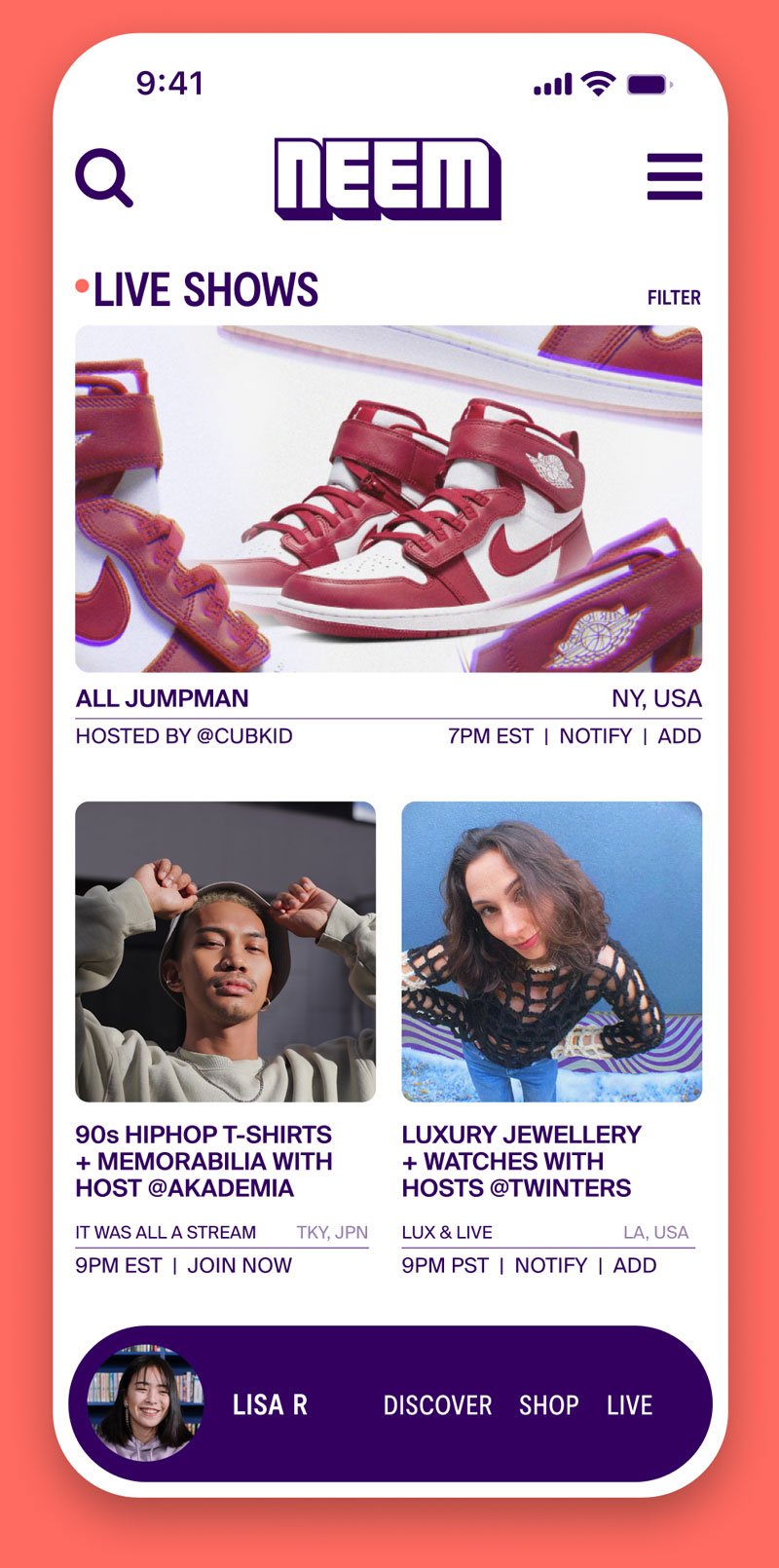
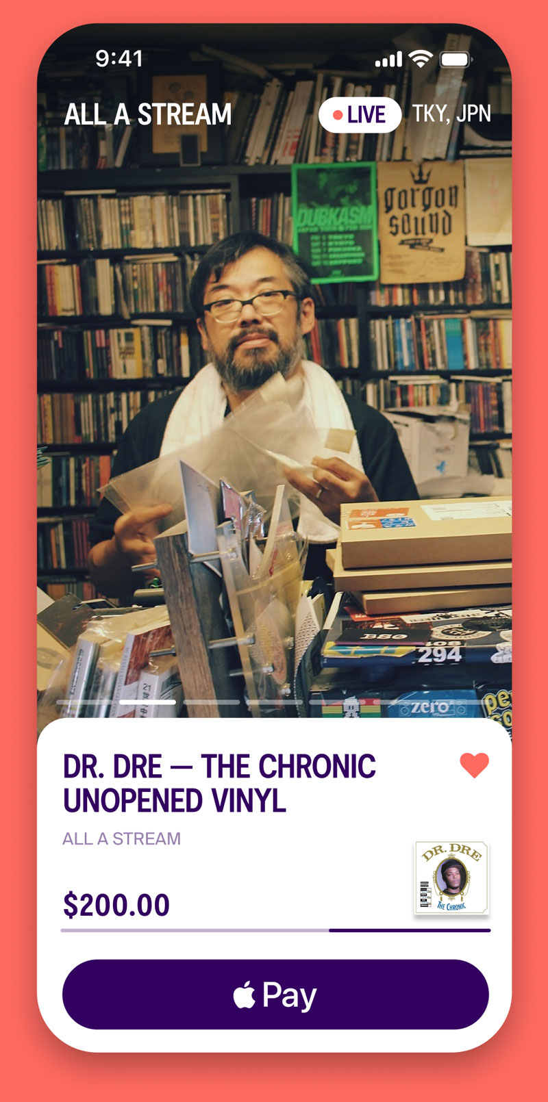
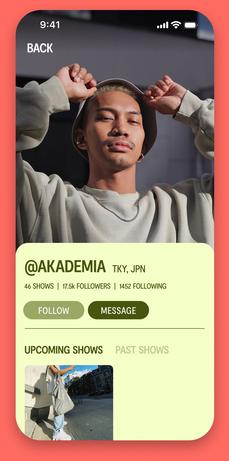
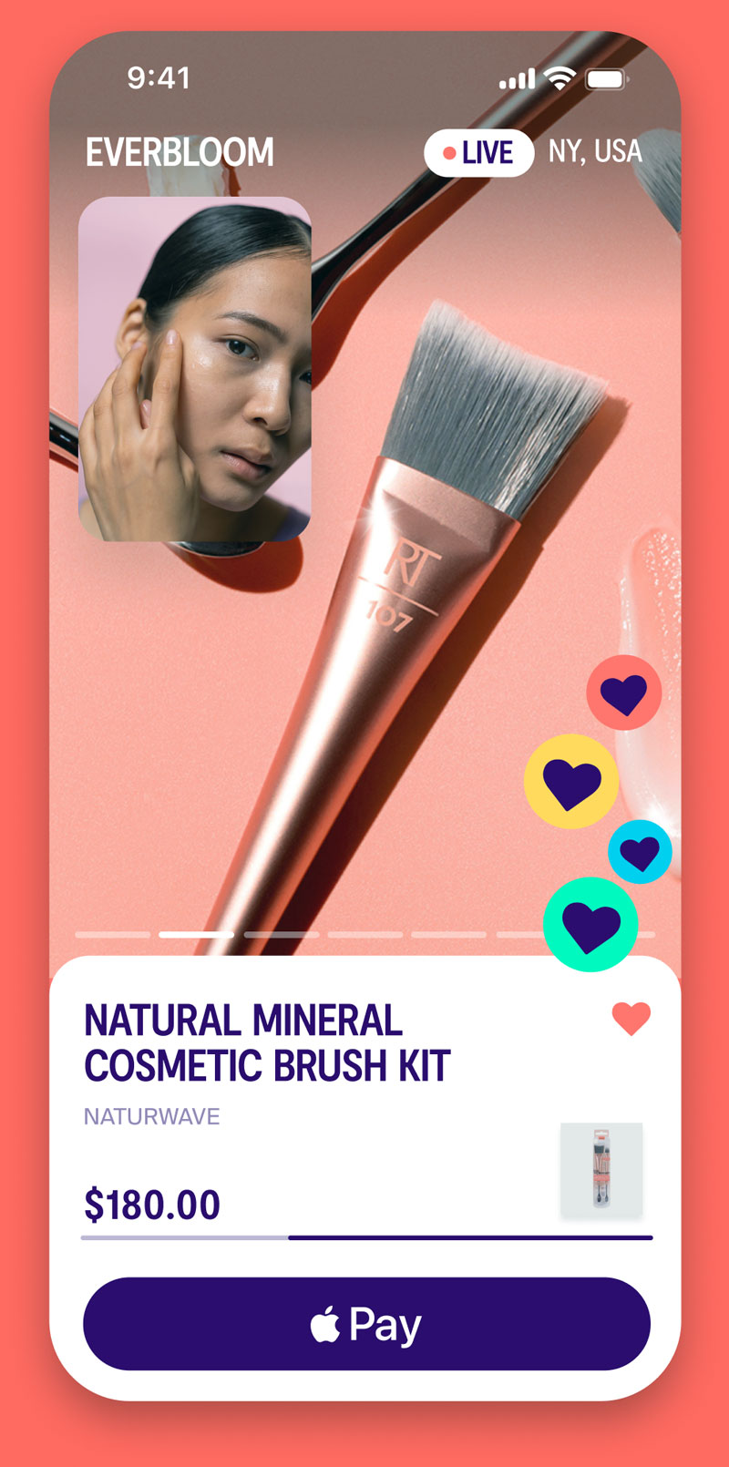
Neem is an interactive shopping community where consumers can watch, connect, and shop exclusive products from their favorite tastemakers.
While this business model is popular in international markets, it hasn’t yet been adopted at scale in the west. This gave us the opportunity to provide clarity on what was truly possible through the platform; but also to dream a little bit as we re-imagined a new – or marginally unknown – type of interactive consumer experience.
Brand messaging
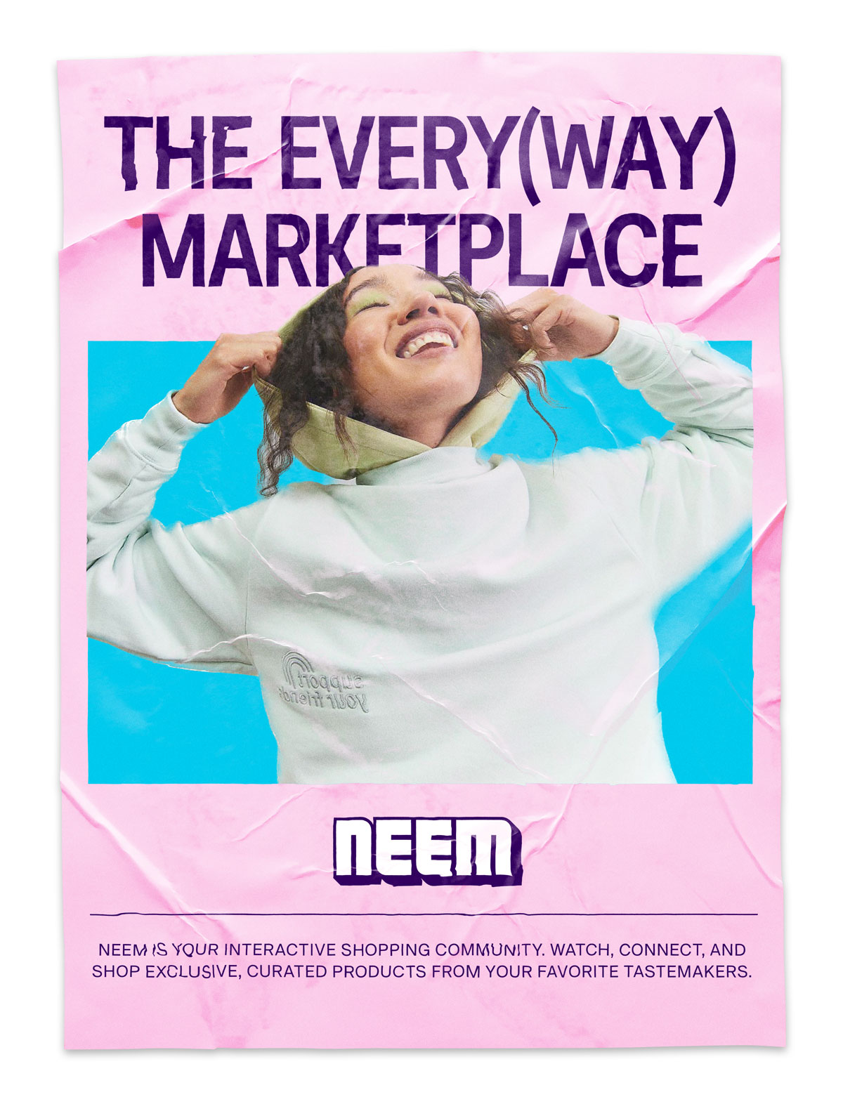
As we explored messaging specifically, we landed on “The Every(way) Marketplace” to reflect the dynamic and holistic nature of the Neem platform as a multi-channel proposition.
Identity design
The brand is a creator marketplace, which meant that we needed to create sufficient visual flexibility for tastemakers to make their “storefronts” their own, regardless of their aesthetic or vibe. This meant a level of customization had to be baked into the Visual ID.
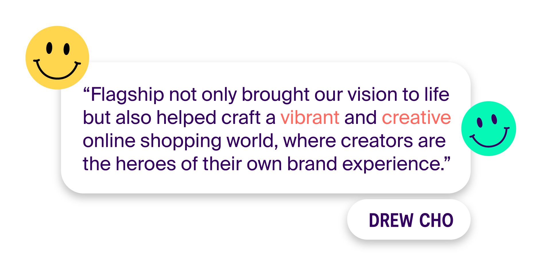
“Final deliverables included a logo, wordmark, color, font selection, animated identities, and patterns and textures that would distinctly identify the brand. We also worked on brand mocks from email signatures and wireframes to swag and out-of-home explorations.”
– Pete Morris, Creative Director