Towards Tomorrow Together case study image

Introduction

Identity design
Logo creation
Messaging
Tone-of-voice
Brand guidelines
UI/UX design
Web development
Implementation and roll out

Prolego is a pioneering team that helps companies navigate the complexities of AI. But Prolego isn’t for those who want a Sunday stroll through the AI landscape. Their business is about journeying into the depth of AI’s abundant possibilities. 
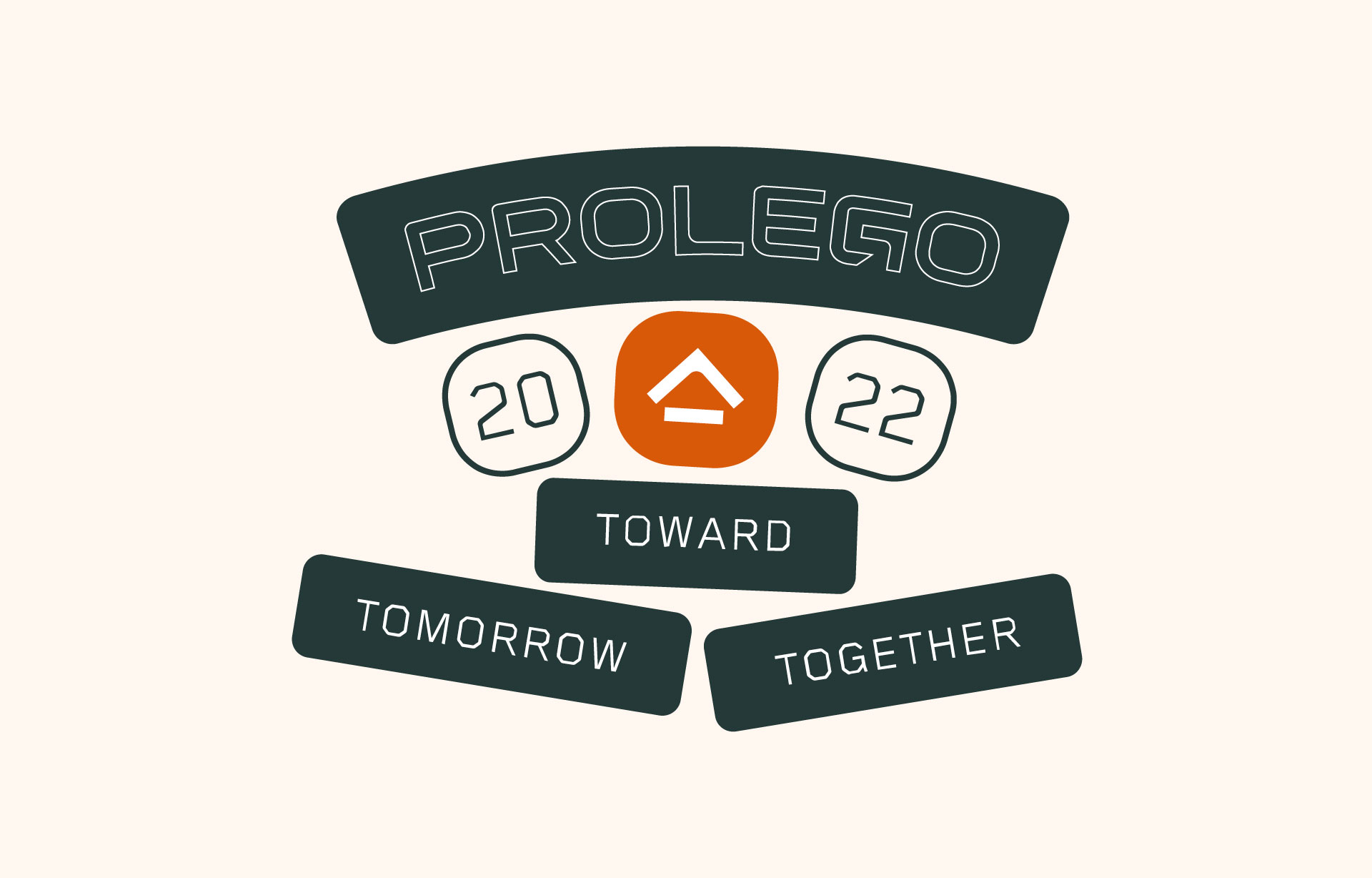
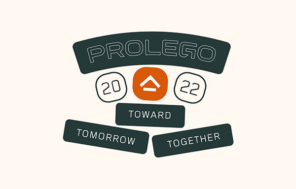
Prolego 2022 badge design with an orange roof-shaped icon in the center, and the tagline "Toward Tomorrow Together" on dark green banners below. Prolego logo design on a cream background, with a house-shaped icon and badges reading "2022 Toward Tomorrow Together."
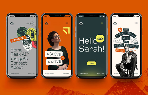
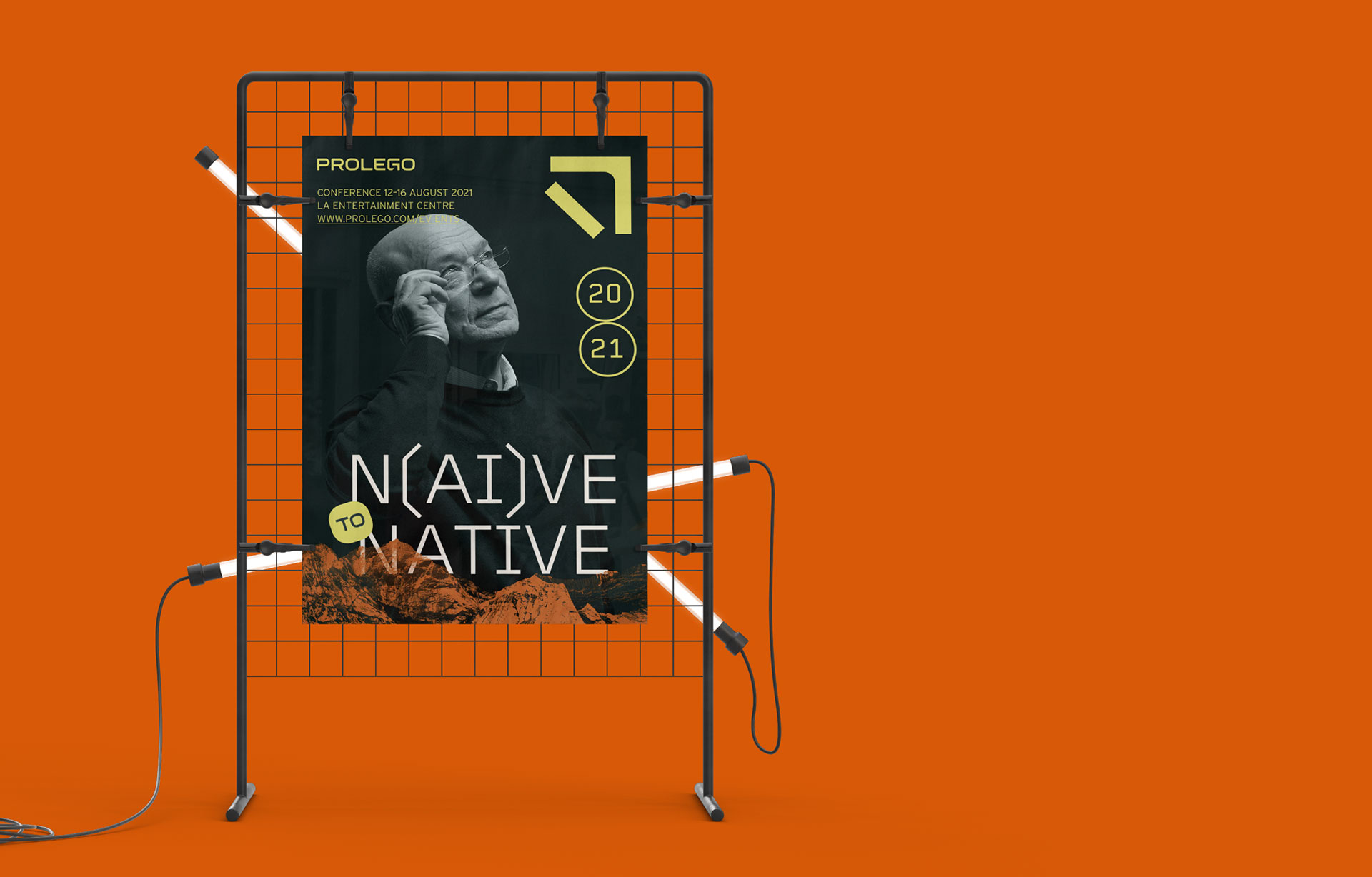
Four smartphone mockups on an orange background displaying Prolego app screens: a home menu with sticker-style badges, a woman in glasses next to the text "N(ai)ve to Native," a dark "Hello Sarah!" login screen, and a promo for a "Pioneering A.I." talk with Kevin Dewalt. Four smartphone mockups of the Prolego website on an orange mountain background: a home menu screen, a woman in a green sweater beside the text "N(AI)VE TO NATIVE," a "Hello Sarah!" login screen, and a black-and-white photo of a man in a suit under the headline "Pioneering A.I. with Kevin Rewalt."

Identity design

When Prolego approached us, things were going well. With their intrepid spirit, they became a trusted consultant to Fortune 1000s, transforming their business operations and internal culture with AI. But there was one big roadblock to the top of the mountain: Prolego’s identity didn’t stand out from the AI clichés of “Minority Report-style blue graphs on glass panel” stock imagery.
Illuminated white sign displaying the Prolego logo, sitting on a dark surface with the background out of focus. Illuminated Prolego logo sign glowing white in a dark room.
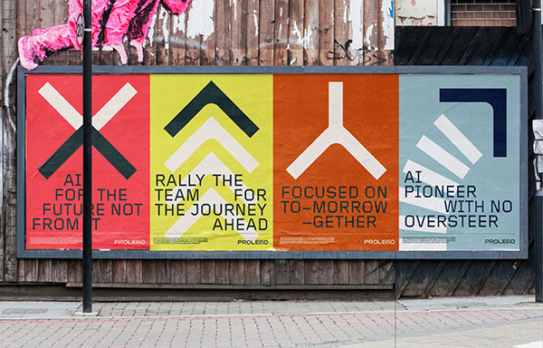
Four-panel Prolego poster campaign pasted on a wooden wall, each panel a different color with a geometric icon and headline: red with an X and "AI for the future not from it," yellow with chevrons and "Rally the team for the journey ahead," orange with a Y-shape and "Focused on tomorrow together," and blue with an arrow and "AI pioneer with no oversteer." Street billboard mounted on a wooden fence, showing four colored panels for Prolego, each with a geometric arrow icon and a different tagline about AI.

Identity design

Our task was to bring them a differentiated look that humanized their perspective and approach to AI. So how did we do it? By taking the brand out of the server room and into the realms of adventure. We wanted to celebrate everything about Prolego’s pioneering ethos. From the logo through to social, we created an unconventional identity that invites you to explore alongside them.

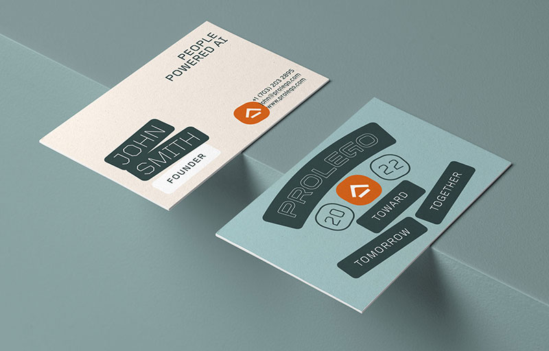
Two Prolego business card mockups angled on a teal surface, one reading "John Smith, Founder" and "People Powered AI," the other showing the Prolego logo with the words "Toward Tomorrow Together." Two Prolego business card mockups angled against a gray background, one tan card reading "People Powered AI" with a sample name and founder title, and one light blue card with the Prolego logo and the words "Toward Together Tomorrow."
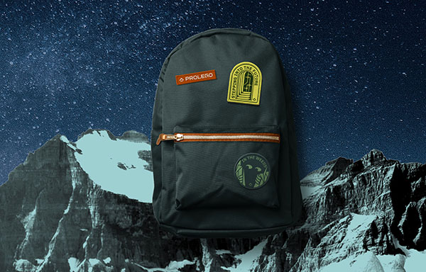
Dark green backpack with an orange zipper, patched with a Prolego logo, a "Stepping Into The Future" patch, and an "In The Weeds" patch, set against a photo of snow-capped mountains under a starry sky. Dark green backpack with an orange Prolego patch, a yellow arch-shaped patch reading "Stepping Into The Future," and a circular green patch reading "In The Weeds," set against a night sky over snow-capped mountains.
Three people wearing Prolego branded apparel: a dark green crewneck sweatshirt with the Prolego logo, an orange t-shirt with a large "GO" graphic and "Peak AI" tag, and a white t-shirt reading "For the future not from it" with a small logo patch on the shoulder.

Brand messaging

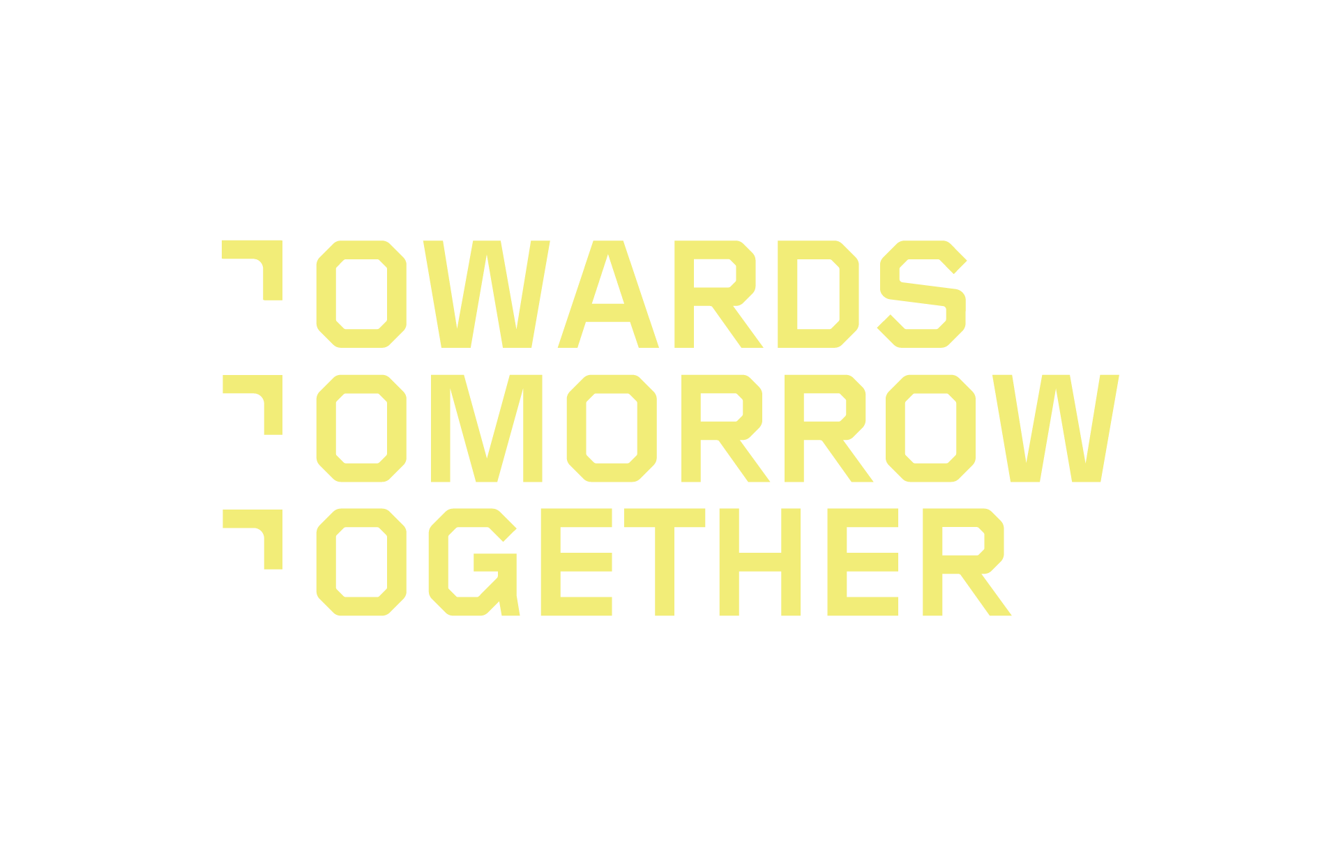
Like any good adventurer, Prolego also needed a mantra to orient its travels. The way we saw it, Prolego is like a trusted guide to businesses as they head into uncharted territory. In other words: “Towards tomorrow together.”
Identity design

“The new identity is all about direction and alignment. We wanted to show how Prolego is a beacon, wayfinder and sherpa, all in one. We leaned on visual cues that aligned to this concept; from subtle highlights around the ‘GO’ in their name, to being more overt with the use of directional elements throughout. The simplicity worked great as an identity and created a limitless landscape of shapes, icons and symbols to build the broader brand system. For a business that focuses on such complex technologies, a simple, creative, and intuitive brand made a lot of sense”

Pete Morris, Creative Director

Browse other works

1
2
3
4
5
6
7
8
9
10
11
12